learn_openpyxl
openpyxl - 5. Charts and Graphs
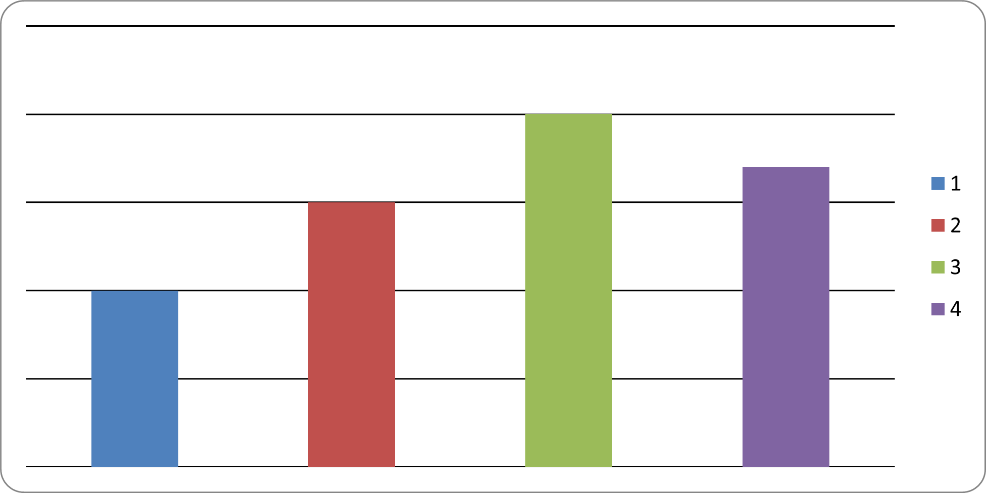
5.1 Creating Charts (Sample: 1) Bar Chart)
from openpyxl import Workbook
from openpyxl.chart import BarChart, Reference

workbook = Workbook()
sheet = workbook.active

# Prepare Data
data = [
    ['Category', 'Value'],
    ['A', 10],
    ['B', 15],
    ['C', 20],
    ['D', 17]
]

# Adding Data into worksheet
for row in data:
    sheet.append(row)

# Create Chart Data Reference
chart_data = Reference(
    sheet,
    min_col = 2,
    max_col = 2,
    min_row = 2,
    max_row = 5
)

# Create Bar Chart
my_chart = BarChart()
my_chart.add_data(chart_data)

# Add Chart into Worksheet
sheet.add_chart(my_chart, "D1")

workbook.save("bar_chart_sample.xlsx")
Source code reference:
openpyxl.chartmodule: https://foss.heptapod.net/openpyxl/openpyxl/-/tree/branch/default/openpyxl/chartchart/bar_chart.py: https://foss.heptapod.net/openpyxl/openpyxl/-/blob/branch/default/openpyxl/chart/bar_chart.py
5.2 Chart Types
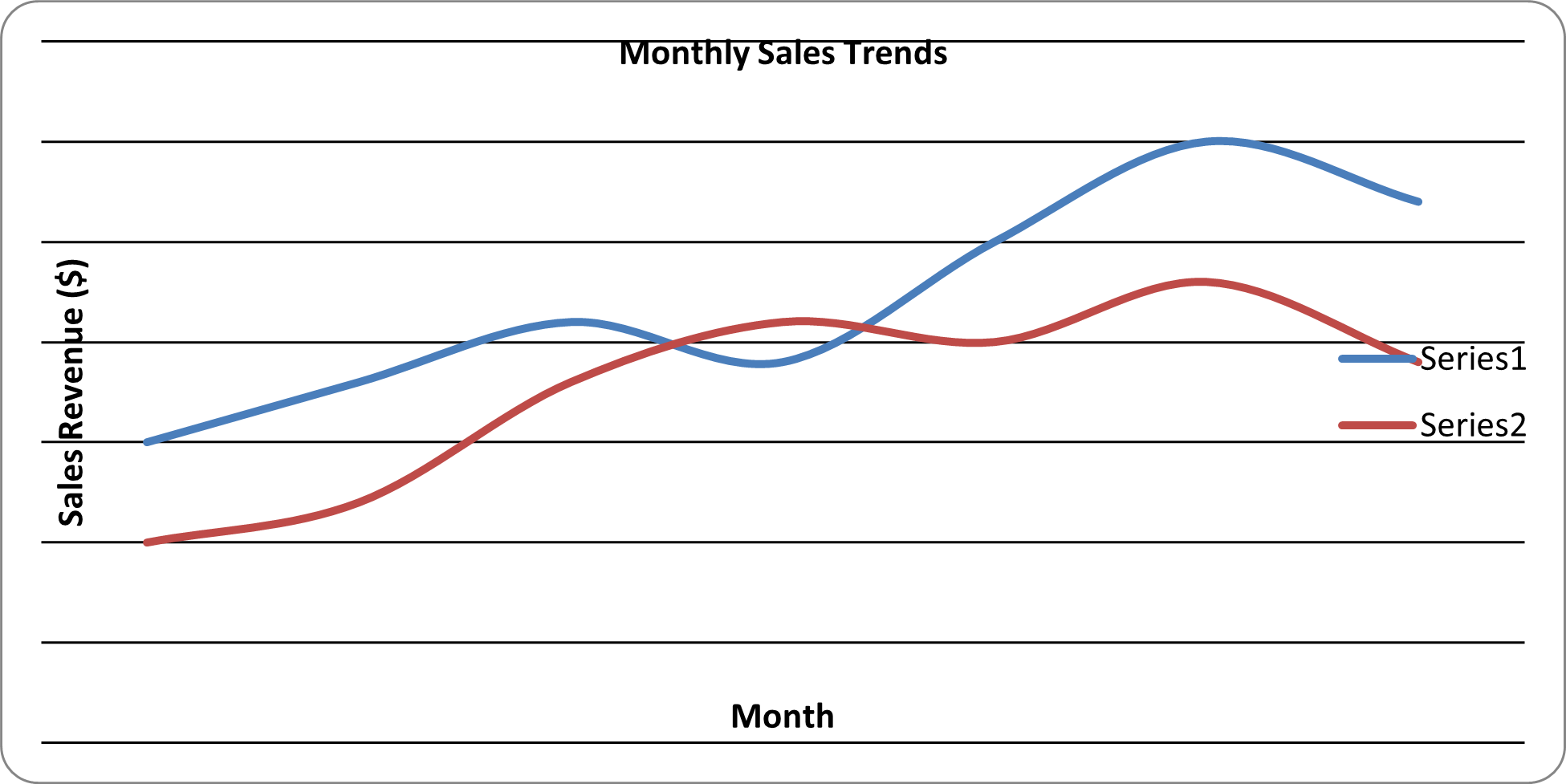
2) Line Chart
from openpyxl import Workbook
from openpyxl.chart import LineChart, Reference

# 0. Initialize WorkBook and WorkSheet

workbook = Workbook()
sheet = workbook.active
sheet.title = "Sales Report"

# 1. Prepare the Data

rows = [
    ["Month", "Online Sales", "InStore Sales"],
    ["Jan", 150, 100],
    ["Feb", 180, 120],
    ["Mar", 210, 180],
    ["Apr", 190, 210],
    ["May", 250, 200],
    ["Jun", 300, 230],
    ["Jul", 270, 190],
]

for row in rows:
    sheet.append(row)

# 2. Initialize the Chart - Line Chart

myChart = LineChart()
myChart.title = "Monthly Sales Trends"
myChart.x_axis.title = "Month"
myChart.y_axis.title = "Sales Revenue ($)"

# 3. Define the Data (Column B and C)

myData = Reference(sheet, min_col=2, max_col=3, min_row=2, max_row = 8)
myChart.add_data(myData)

# 4. Define Categories (Column A)

myCats = Reference(sheet, min_col=1, min_row=2, max_row=8)
myChart.set_categories(myCats)

# 5. Add chart into the sheet

sheet.add_chart(myChart, "E2")

# 6. Save workbook

workbook.save("Line_Chart_Sample.xlsx")
Source code reference:
chart/line_chart.py: https://foss.heptapod.net/openpyxl/openpyxl/-/blob/branch/default/openpyxl/chart/line_chart.py
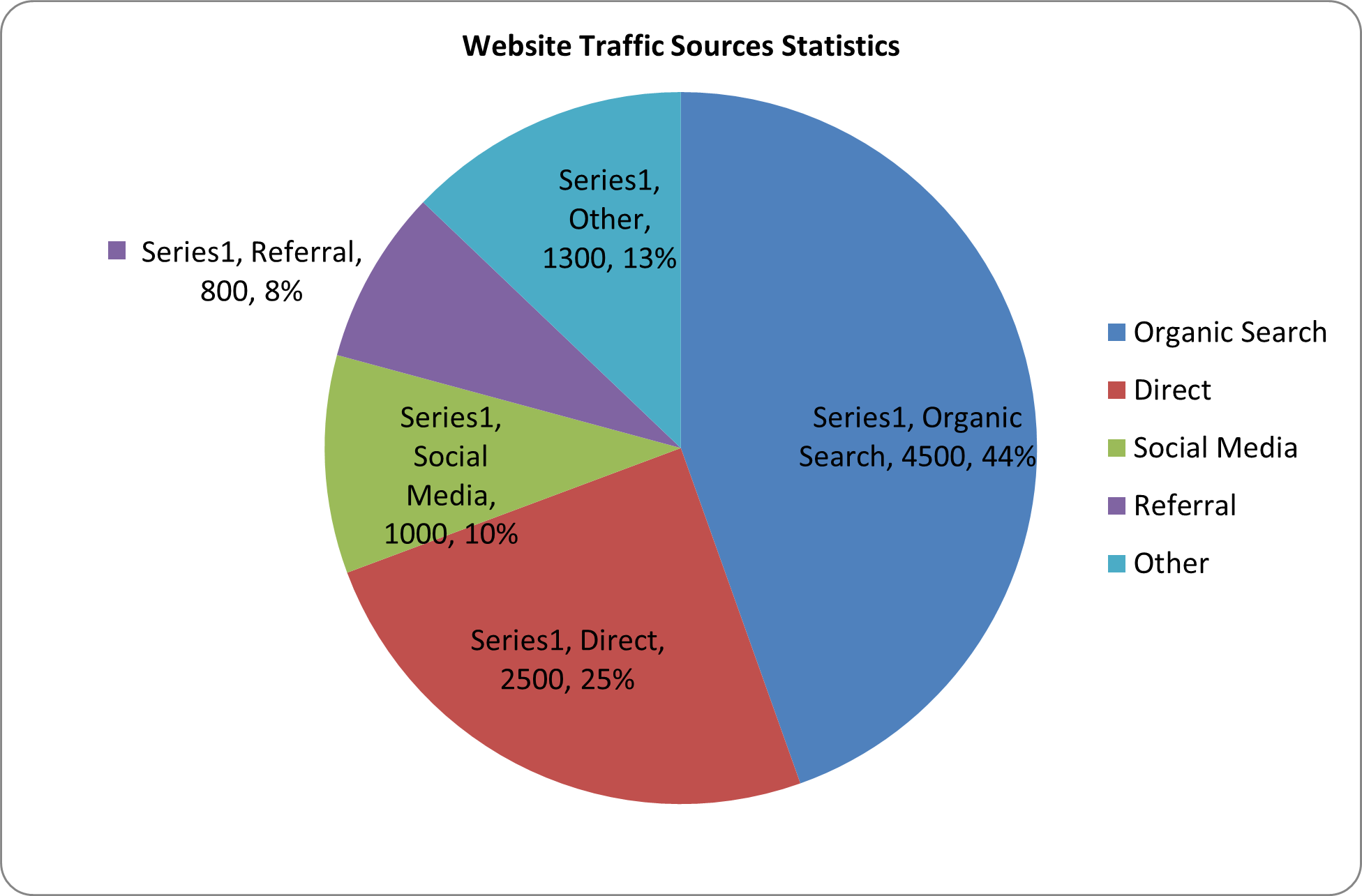
3) Pie Chart
from openpyxl import Workbook
from openpyxl.chart import PieChart, Reference
from openpyxl.chart.label import DataLabelList

# 0. Initialize WorkBook and WorkSheet

workbook = Workbook()
sheet = workbook.active
sheet.title = "Traffic Data"

# 1. Prepare the Data

rows = [
    ["Source", "Visitors"],
    ["Organic Search", 4500],
    ["Direct", 2500],
    ["Social Media", 1000],
    ["Referral", 800],
    ["Other", 1300]
]

for row in rows:
    sheet.append(row)

# 2. Initialize the Chart - Pie Chart

myChart = PieChart()
myChart.title = "Website Traffic Sources Statistics"

# 3. Define the Data (Column B)

myData = Reference(sheet, min_col=2, max_col=2, min_row=2, max_row = 6)
myChart.add_data(myData, titles_from_data = False)

# 4. Define Categories (Column A)

myCats = Reference(sheet, min_col=1, max_col=1, min_row=2, max_row=6)
myChart.set_categories(myCats)

# Optional: add Percent Labels

myChart.dataLabels = DataLabelList()
myChart.dataLabels.showPercent = True
myChart.dataLabels.showCategoryname = False

# 5. Add chart into the sheet

sheet.add_chart(myChart, "D2")

# 6. Save workbook

workbook.save("Pie_Chart_Sample.xlsx")
print("Pie Chart generated successfully!")
Source code reference:
chart/pie_chart.py: https://foss.heptapod.net/openpyxl/openpyxl/-/blob/branch/default/openpyxl/chart/pie_chart.py
4) Scatter Chart
from openpyxl import Workbook
from openpyxl.chart import Reference, ScatterChart, Series

# 0. Initialize Workbook & Worksheet

workbook = Workbook()
sheet = workbook.active

# 1. Preparation of the Data

sheet.title = "Scatter Data"

data = [
    ["Ad Spend", "New Customer"],
    [100, 12],
    [200, 25],
    [300, 30],
    [400, 45],
    [500, 70],
    [600, 86]
]

# 2. Add data into Worksheet

for row in data:
    sheet.append(row)

# 3. Initialize Chart: Scatter Chart

myChart = ScatterChart()
myChart.title = "Ad Spend vs. Customer Aquisition"
myChart.x_axis.title = "Budget ($)"
myChart.y_axis.title = "New Customers"
# myChart.style = 15
myChart.scatterStyle = "marker"

# 4. Define X & Y Reference

xValues = Reference(sheet, min_col=1, max_col=1, min_row=2, max_row=7)
yValues = Reference(sheet, min_col=2, max_col=2, min_row=2, max_row=7)

# 5. Create Series object to Link X and Y

mySeries = Series(yValues, xValues, title = "Acquisition Rate")
myChart.series.append(mySeries)

# Optional: Markers

mySeries.marker.symbol = "circle"
mySeries.marker.graphicalProperties.solidFill = "0000FF"

# Add the Chart to the Worksheet

sheet.add_chart(myChart, "D2")

# Save the file

workbook.save("Scatter_Chart_Sample.xlsx")
print("Scatter Chart generated successfully!")
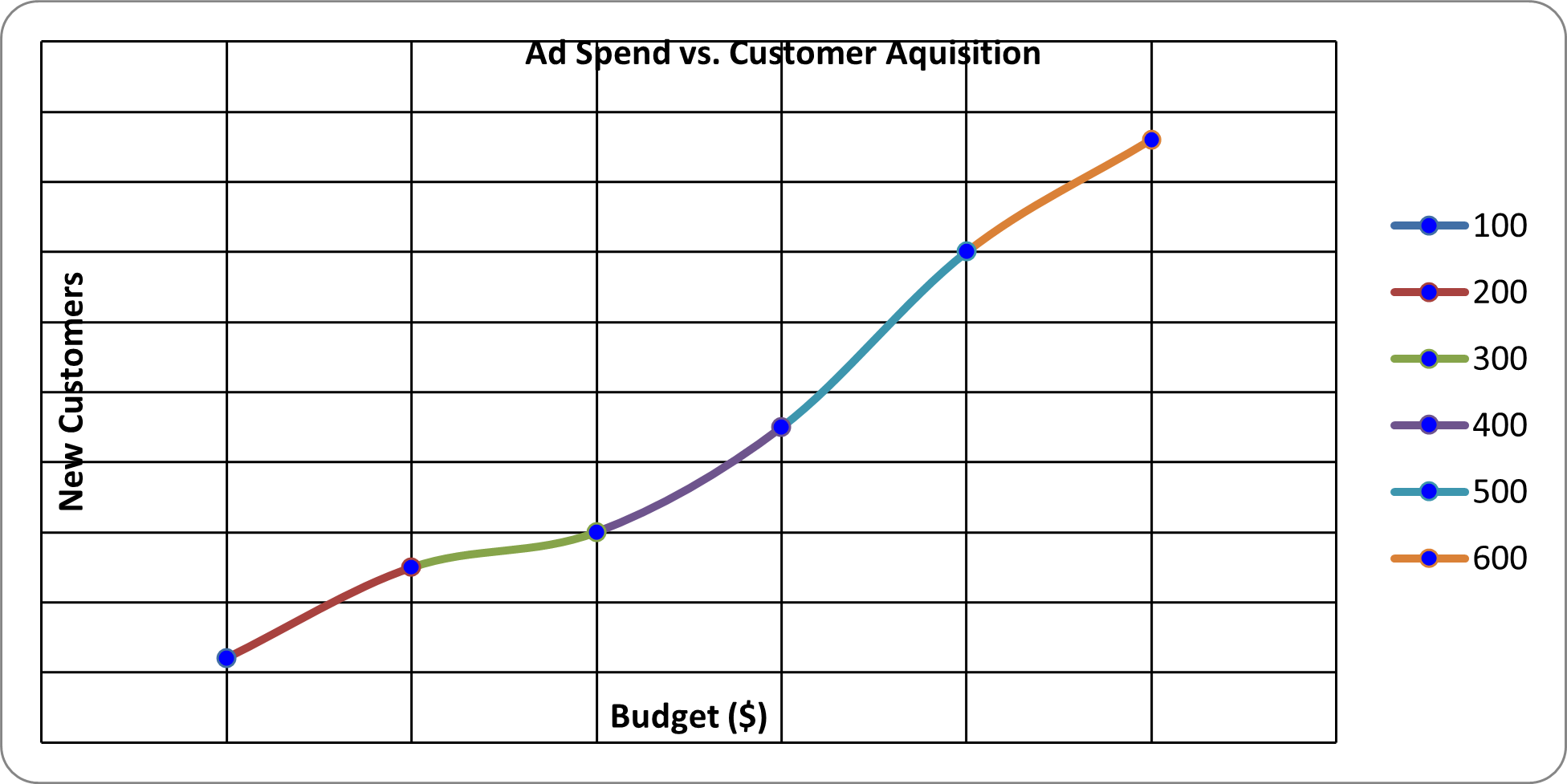
Source code reference:
chart/scatter_chart.py: https://foss.heptapod.net/openpyxl/openpyxl/-/blob/branch/default/openpyxl/chart/scatter_chart.py
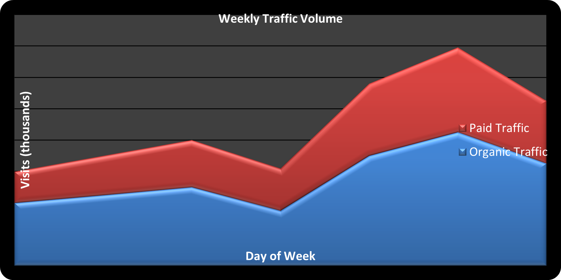
5) Area Chart
from openpyxl import Workbook
from openpyxl.chart import Reference, AreaChart

workbook = Workbook()
sheet = workbook.active
sheet.title = "Web Analytics"

data = [
    ["Day", "Organic Traffic", "Paid Traffic"],
    ["Mon", 40, 20],
    ["Tue", 45, 25],
    ["Wed", 50, 30],
    ["Thu", 35, 27],
    ["Fri", 70, 46],
    ["Sat", 85, 54],
    ["Sun", 65, 40]
]

for row in data:
    sheet.append(row)

chart = AreaChart()
chart.title = "Weekly Traffic Volume"
chart.style = 42
chart.x_axis.title = "Day of Week"
chart.y_axis.title = "Visits (thousands)"

data_ref = Reference(sheet, min_col=2, max_col=3, min_row=1, max_row=8)
chart.add_data(data_ref, titles_from_data=True)

cats_ref = Reference(sheet, min_col=1, max_col=1, min_row=2, max_row=8)
chart.set_categories(cats_ref)

chart.grouping = "stacked"

sheet.add_chart(chart, "E2")

workbook.save("Area_Chart_Example.xlsx")
Source code reference:
chart/area_chart.py: https://foss.heptapod.net/openpyxl/openpyxl/-/blob/branch/default/openpyxl/chart/area_chart.py
6) Radar Chart
from openpyxl import Workbook
from openpyxl.chart import Reference, RadarChart

workbook = Workbook()
sheet = workbook.active
sheet.title = "Skill Assessmnet"

data = [
    ["Metric", "Developer A", "Developer B", "Developer C"],
    ["Coding", 90, 94, 85],
    ["Debugging", 86, 89, 93],
    ["Documentation", 70, 95, 84],
    ["Speed", 85, 70, 80],
    ["Teamwork", 93, 85, 65]
]

for row in data:
    sheet.append(row)

chart = RadarChart()
chart.title = "Developer Skills Assessment"
chart.style = 26

data = Reference(sheet, min_col=2, max_col=4, min_row=1, max_row=6)
labels = Reference(sheet, min_col=1, max_col=1, min_row=2, max_row=6)

chart.add_data(data, titles_from_data=True)
chart.set_categories(labels)

sheet.add_chart(chart, "F2")

workbook.save("Radar_Chart_Sample.xlsx")

Source code reference:
chart/radar_chart.py: https://foss.heptapod.net/openpyxl/openpyxl/-/blob/branch/default/openpyxl/chart/radar_chart.py
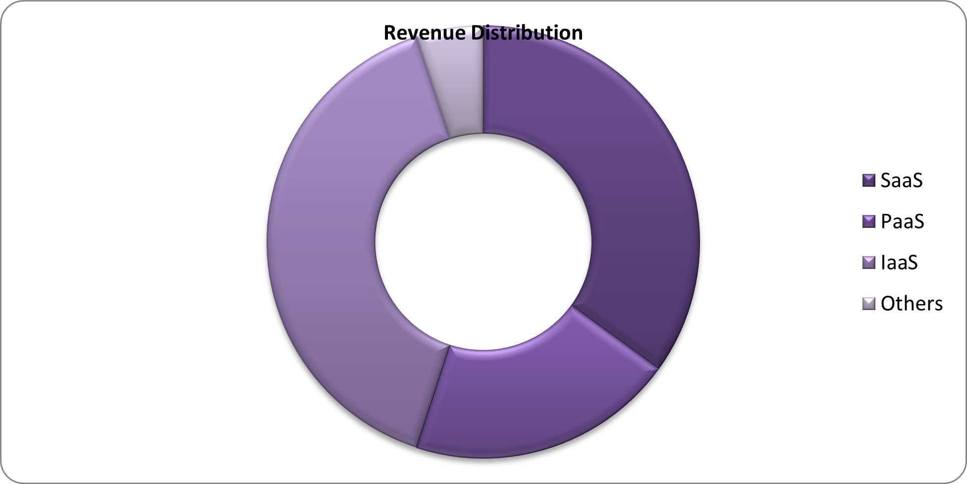
7) Doughnut Chart (within Pie Chart)
from openpyxl import Workbook
from openpyxl.chart import Reference, DoughnutChart

workbook = Workbook()
sheet = workbook.active
sheet.title = "Market Share for Cloud"

# Warning for too long Sheet title: seems max is 30
# UserWarning: Title is more than 31 characters. Some applications may not be able to read the file
#   warnings.warn("Title is more than 31 characters. Some applications may not be able to read the file")

data = [
    ["Category", "Percentage"],
    ["SaaS", 35],
    ["PaaS", 20],
    ["IaaS", 40],
    ["Others", 5]
]

for row in data:
    sheet.append(row)

chart = DoughnutChart()
data = Reference(sheet, min_col=2, max_col=2, min_row=1, max_row=5)
labels = Reference(sheet, min_col=1, max_col=1, min_row=2, max_row=5)

chart.add_data(data, titles_from_data=True)
chart.set_categories(labels)
chart.title = "Revenue Distribution"
chart.style = 30

chart.holeSize = 50

sheet.add_chart(chart, "D2")

workbook.save("Doughnut_Chart_Sample.xlsx")
Source code reference:
DoughnutChat(_PieChartBase): https://foss.heptapod.net/openpyxl/openpyxl/-/blob/branch/default/openpyxl/chart/pie_chart.py#L89
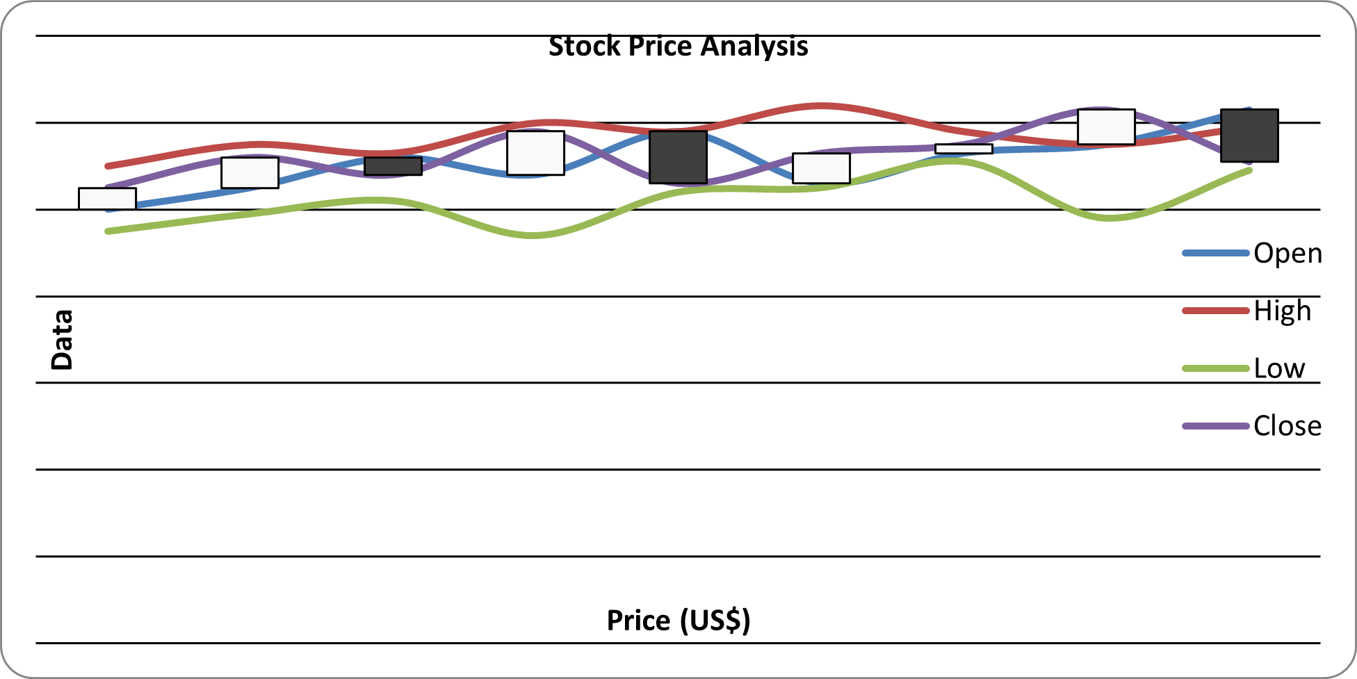
8) Stock Chart
from openpyxl import Workbook
from openpyxl.chart import Reference, StockChart, Series
from openpyxl.chart.axis import ChartLines
from openpyxl.chart.updown_bars import UpDownBars

workbook = Workbook()
sheet = workbook.active
sheet.title = "StockData"

data = [
    ["Date", "Open", "High", "Low", "Close"],
    ["2024-12-01", 100, 110, 95, 105],
    ["2024-12-02", 105, 115, 99, 112],
    ["2024-12-03", 112, 113, 102, 108],
    ["2024-12-04", 108, 120, 94, 118],
    ["2024-12-05", 118, 118, 104, 106],
    ["2024-12-06", 106, 124, 105, 113],
    ["2024-12-07", 113, 118, 111, 115],
    ["2024-12-08", 115, 115, 98, 123],
    ["2024-12-09", 123, 119, 109, 111]
]

for row in data:
    sheet.append(row)

chart = StockChart()
chart.title = "Stock Price Analysis"

data = Reference(sheet, min_col=2, max_col=5, min_row=1, max_row=10)
labels = Reference(sheet, min_col=1, max_col=1, min_row=2, max_row=10)

chart.add_data(data, titles_from_data=True)
chart.set_categories(labels)

volume_series = chart.series[0]

chart.hiLowLines = ChartLines()

chart.upDownBars = UpDownBars()

chart.x_axis.title = "Price (US$)"
chart.y_axis.title = "Data"

sheet.add_chart(chart, "G2")

workbook.save("Stock_Chart_Sample.xlsx")
print("Stock Chart Generated Successfully!")
Source code reference:
chart/stock_chart.py: https://foss.heptapod.net/openpyxl/openpyxl/-/blob/branch/default/openpyxl/chart/stock_chart.py
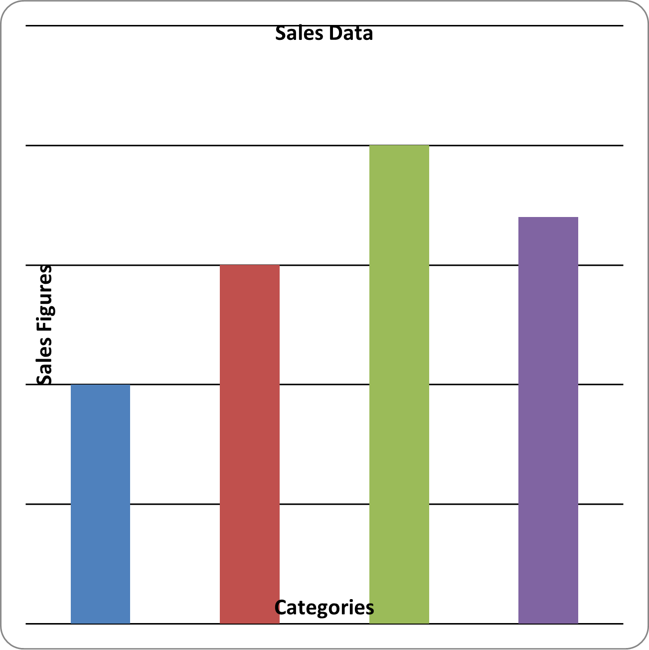
5.3 Customizing Charts
from openpyxl import Workbook
from openpyxl.chart import BarChart, Reference

workbook = Workbook()
sheet = workbook.active

# Prepare Data
data = [
    ['Category', 'Value'],
    ['A', 10],
    ['B', 15],
    ['C', 20],
    ['D', 17]
]

# Adding Data into worksheet
for row in data:
    sheet.append(row)

# Create Chart Data Reference
chart_data = Reference(
    sheet,
    min_col = 2,
    max_col = 2,
    min_row = 2,
    max_row = 5
)

# Create Bar Chart
my_chart = BarChart()
my_chart.title = "Sales Data"
my_chart.add_data(chart_data)

my_chart.x_axis.title = "Categories"
my_chart.y_axis.title = "Sales Figures"

my_chart.series[0].name = "Sales Figures"

my_chart.legend = None

my_chart.width = 10
my_chart.height = 10

# Add Chart into Worksheet
sheet.add_chart(my_chart, "D2")

workbook.save("bar_chart_sample.xlsx")
5.4 Adding Charts to Worksheets
sheet.add_chart(chart, "A10") # Places the chart starting at cell A10
Last Updated at: 1/1/2026, 8:36:44 PM